CLOSURE WINE
ART YOU CAN TASTE.
A STORY YOU CAN HOLD.
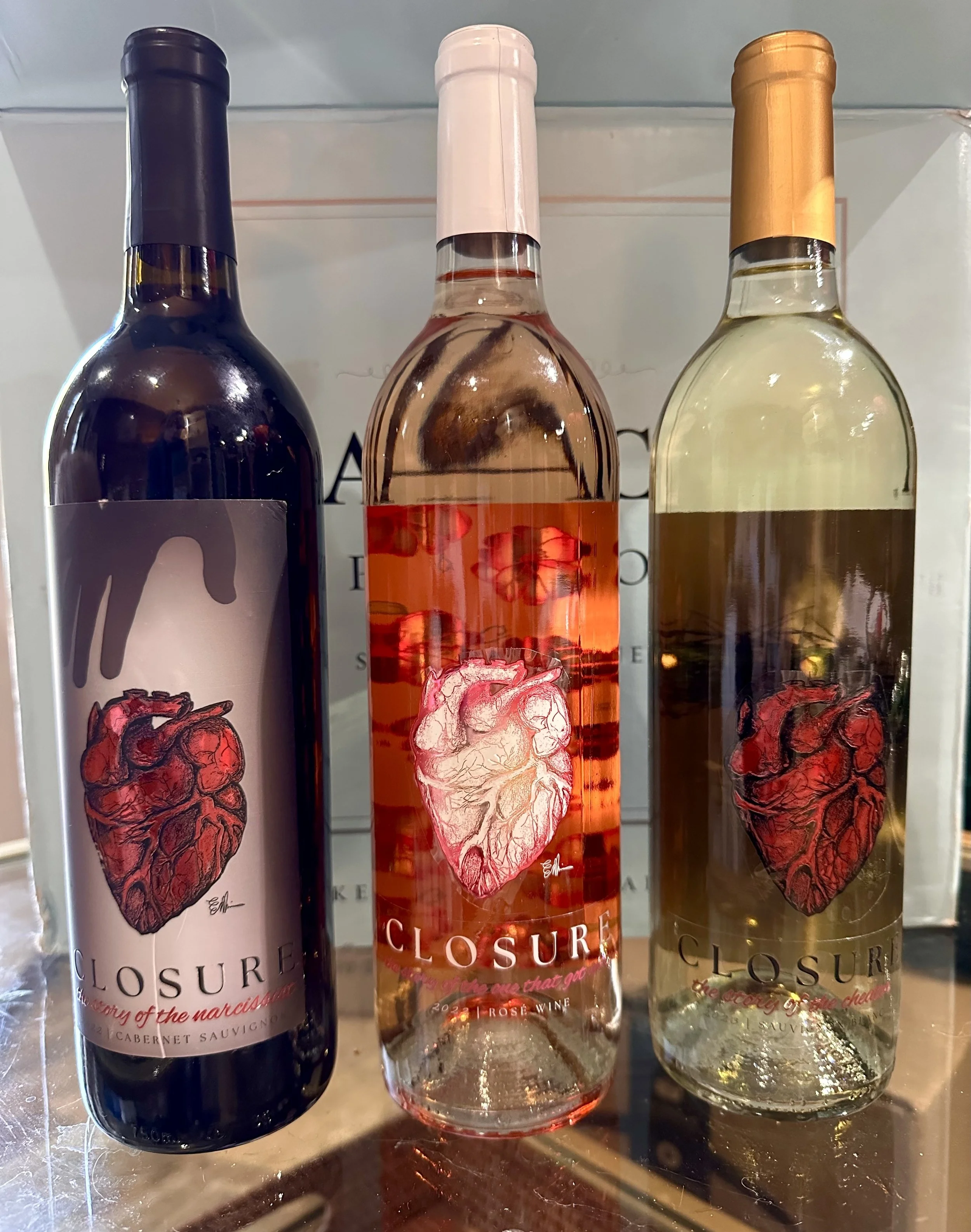
Three wines. Three relationship stories. One visual language.
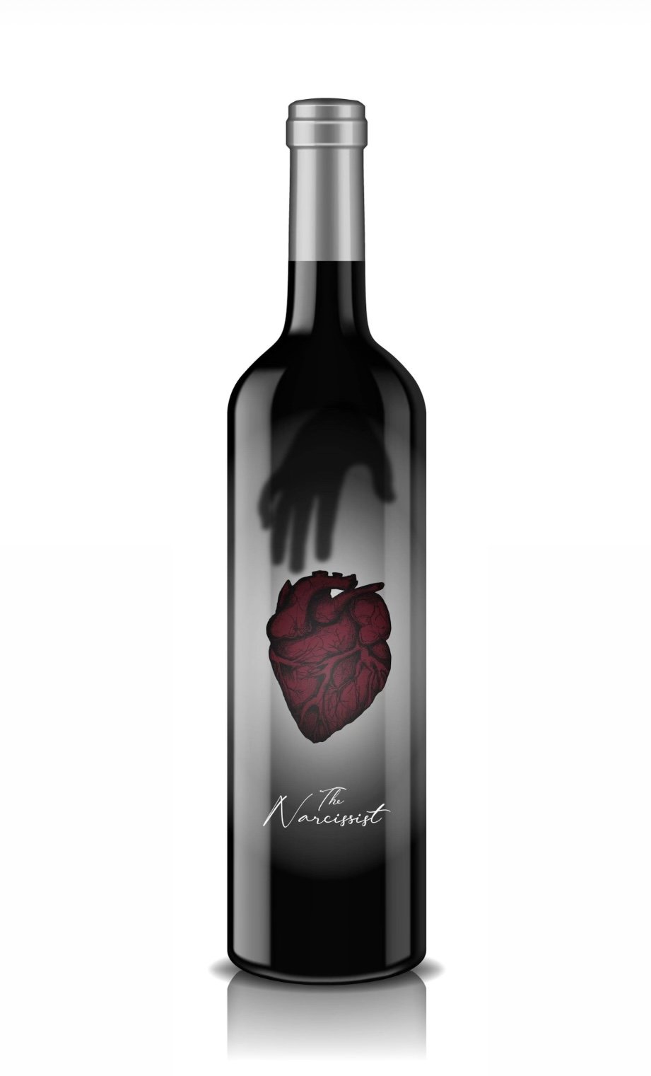
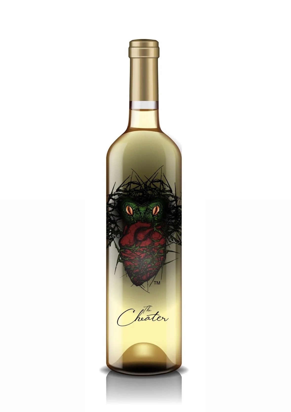
The concept began with three names: The Narcissist, The Cheater, and The One That Got Away. I was brought in as the artist and creative partner to determine what those stories would look and feel like.
Starting with original hand-drawn artwork, I developed a visual language around the human heart, using symbolism, composition and contrast to give each wine its own emotional identity while connecting the collection as a whole.
ORIGINAL ART · CREATIVE DIRECTION · VISUAL STORYTELLING · PACKAGING DESIGN
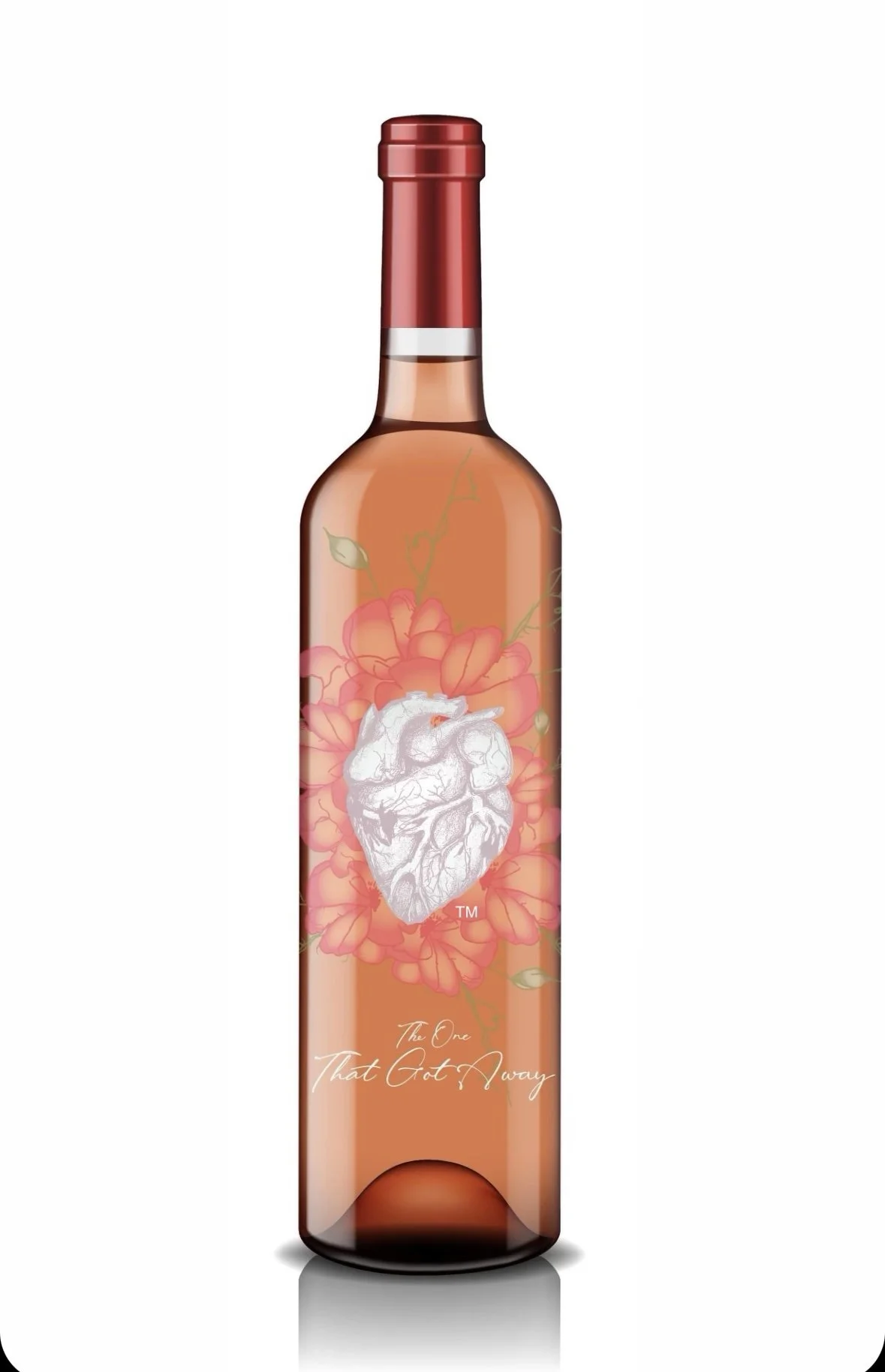
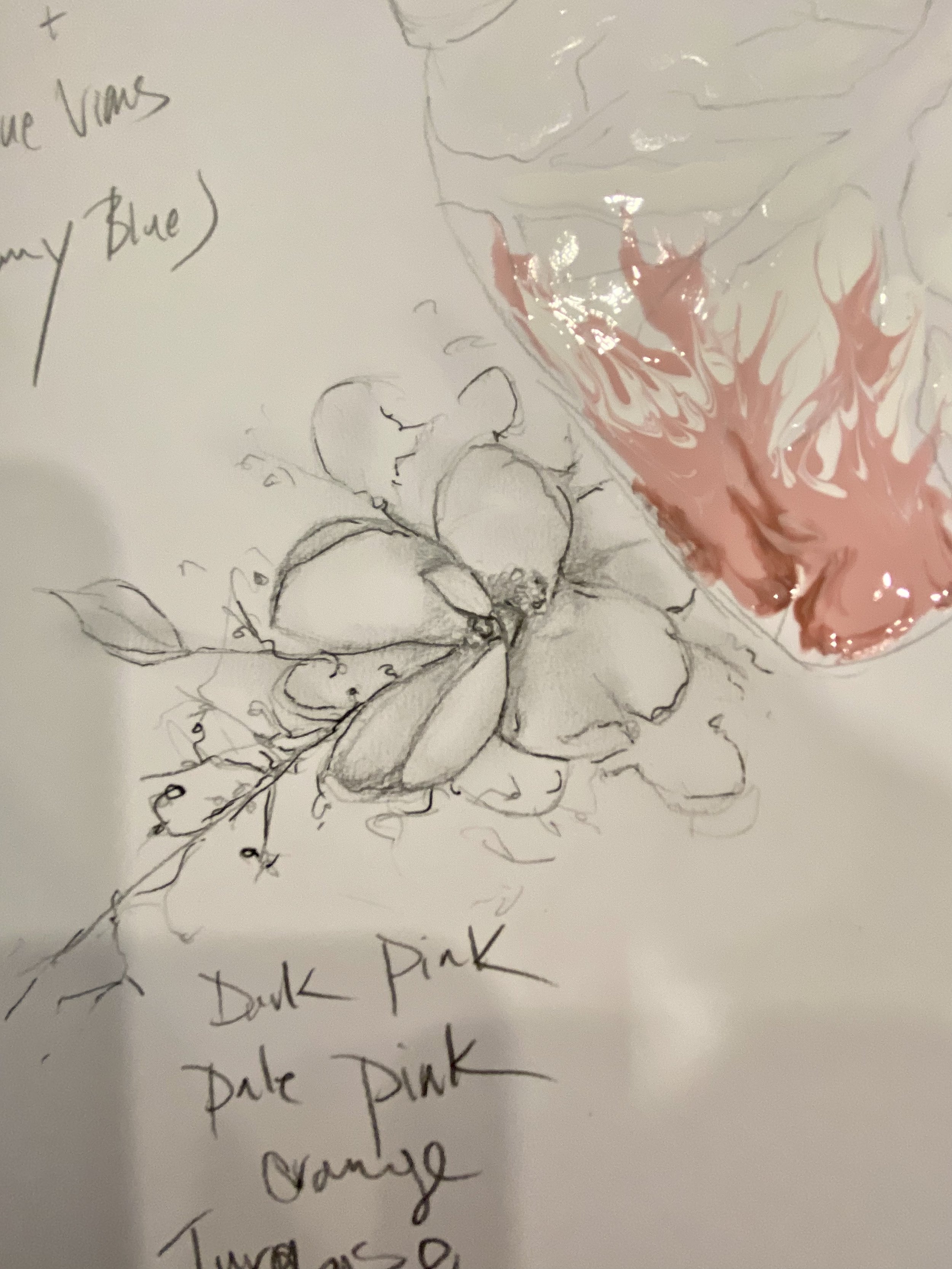
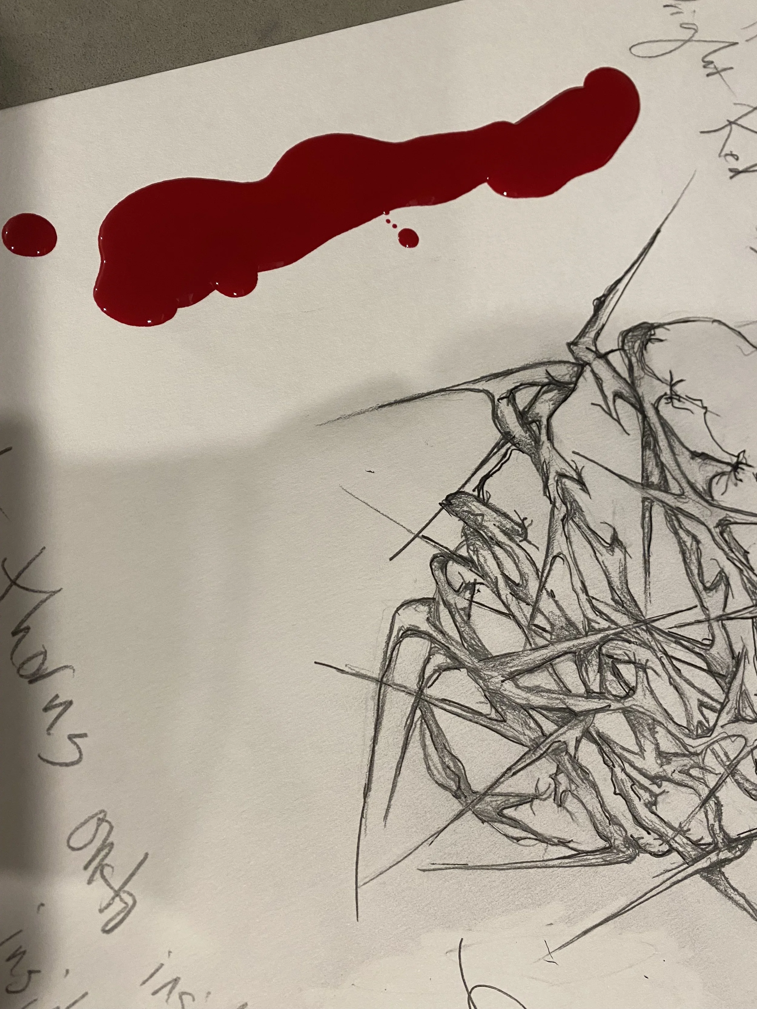
FROM PENCIL TO BOTTLE. THE ART STARTED BY HAND.
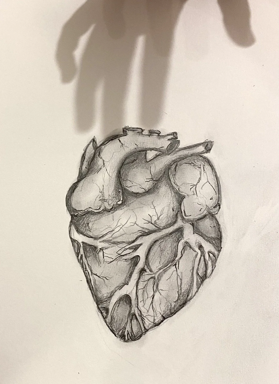
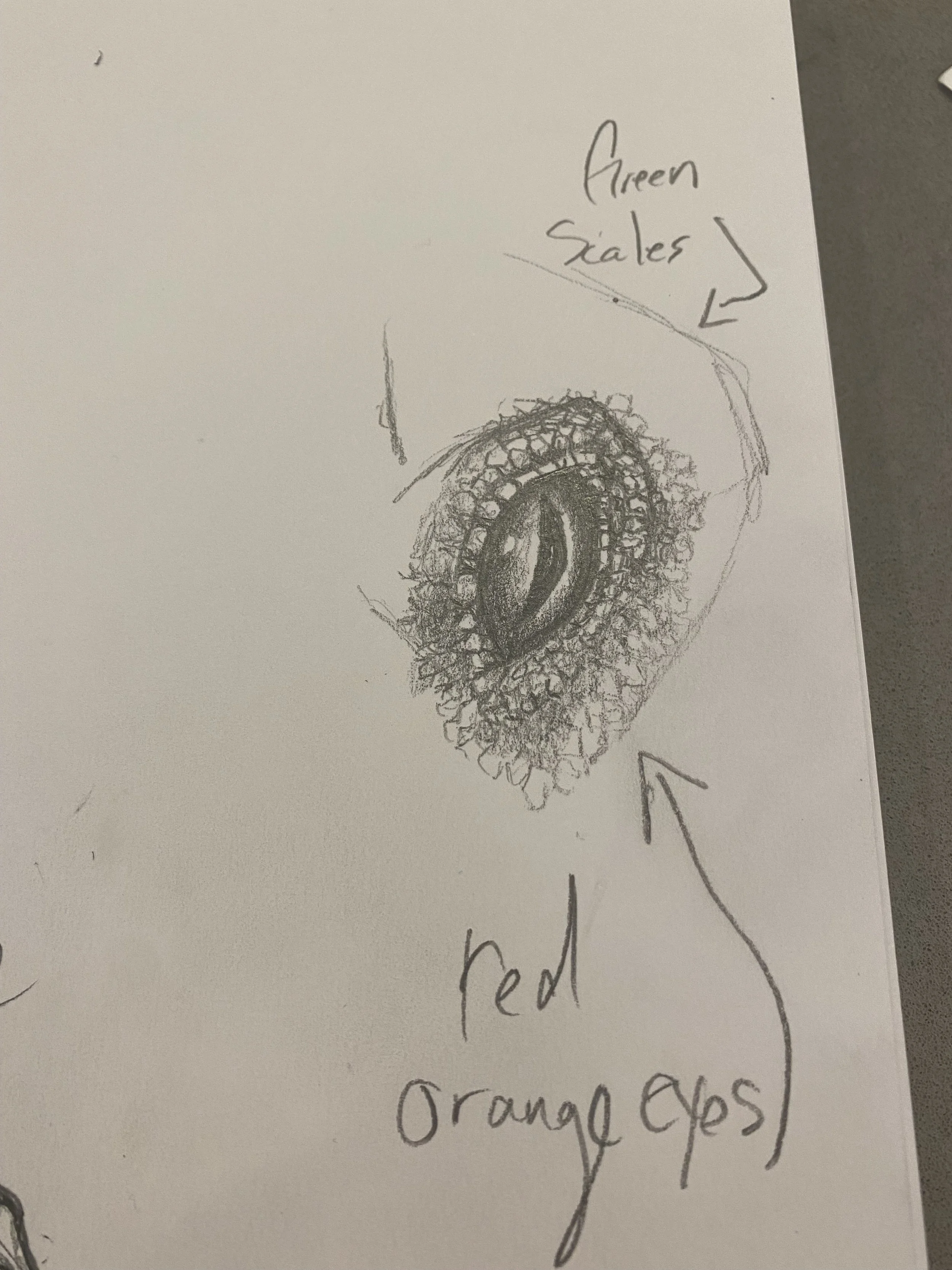
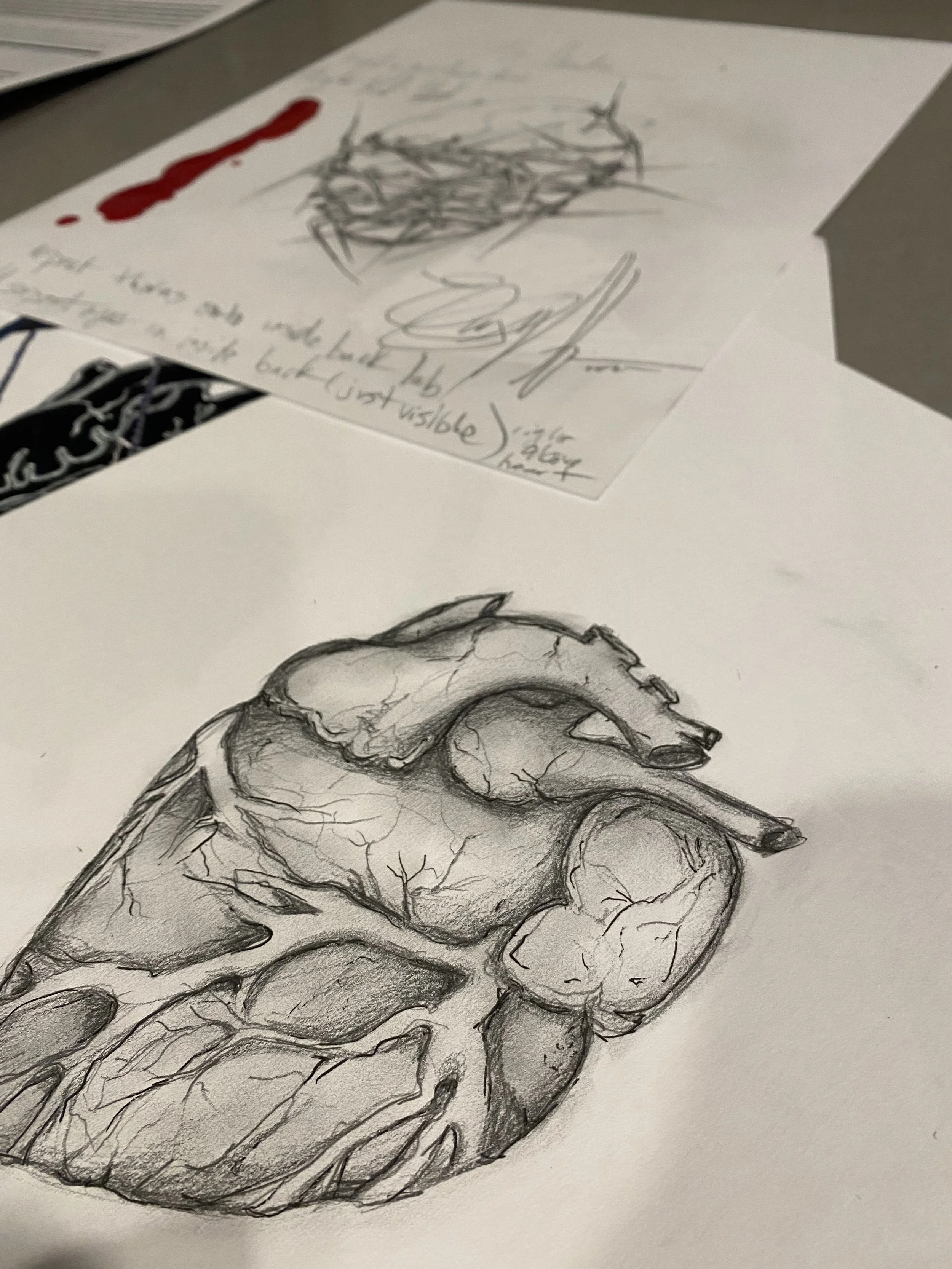
MAKING THE ART TANGIBLE
Translating the original artwork onto glass required another kind of creativity. I worked closely with my graphic designer to convert my hand-drawn work into production-ready files while protecting the detail and character of the original drawings.
I also wanted the heart imagery to have a physical presence and not simply appear printed on the bottle. That decision led us to a specialized East Coast printer with the capability to produce the raised treatment I envisioned, turning a visual element into something you could actually feel not just emotionally but physically.
THE PROCESS
The finished bottles began here: with pencil, paper and an idea. I developed each design by hand, exploring anatomy, symbolism, color and composition until each wine had its own visual identity. Every detail was intentional: the shadow reaching toward the heart of The Narcissist, the thorns and reptilian eyes of The Cheater, and the softer florals surrounding The One That Got Away.
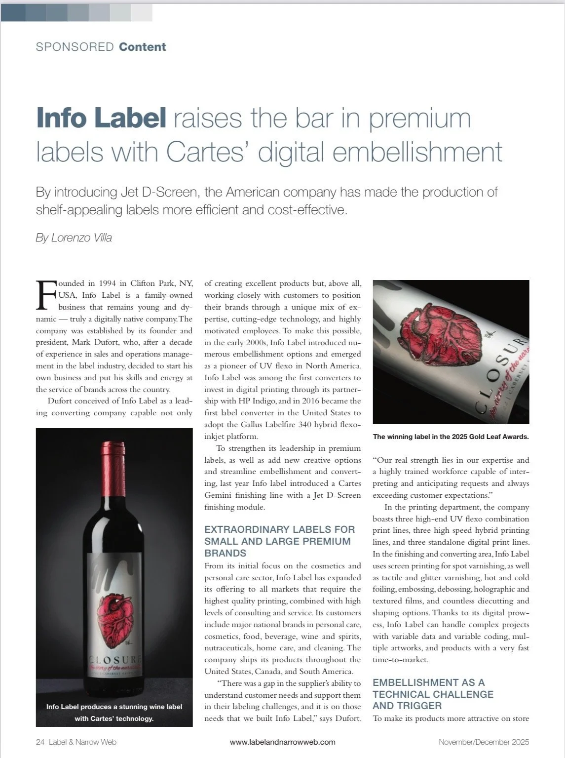
FROM HAND-DRAWN ART TO AWARD-WINNING PACKAGING.
2025 GOLD LEAF AWARD WINNER